The Marketing Department Needs a Hard Slap Across the Chops

Several years ago I did quite a riff on stupid car names. It’s good stuff, go back and read it if you get a chance.

In that same vein comes today’s post.

Stupid cell phone names. Yup, the mobile phone manufacturers have gone well past idiot car names and have slipped into ridiculous.

Since I work way, way too much with mobile phones, I have to not only see these dumb names, but utter them aloud.

Here’s my personal top eleven list of “Someone Should Get Slapped for that Brand Name”


  1. HTC Salsa: Seriously? Salsa? Because I’m going to dip a chip into the device? Bleah. Just Bleah!
  2. Palm Pre: The suffix pre means before. So this is the phone that’s what? Before the actual phone? Before the demise of Palm? Before HP killed it?
  3. Samsung :): Oh how I wish I was making that up. The actual name of the phone is :) How do you even go to the store and ask for that? “Um, yes, I’d like a sideways smiley please?” Lame. Lame. Lame.
  4. HTC Rhyme : Rhymes with stupid.
  5. Casio G’zOne Commando: First of all I can’t get over Casio, maker of tacky Dad-watches is also making phones. This is a kind of cool looking device, but godDAMN it’s a bad name. First of all, what the eff is G’zOne? And second of all, commando makes me think of going without chones. I don’t think my mobile device should evoke that.
  6. Motorola Citrus : Mmmmm! Lemony!
  7. Motorola Photon : I tested this device and I actually liked it a lot. But neither The Good Man nor I could stop pointing the device at each other and going “pew pew!” It is, after all, a photon. Pew!
  8. LG Remarq : One, you misspelled it. Two, my remarks are “WHAT THE SEVENTEEN KINDS OF SAM HELL ARE YOU THINKING with this name?!?!” That concludes my remarqs.
  9. Sanyo Innuendo : I heard a rumor this was a cool device, but it was just innuendo.
  10. LG Rumor : Oh for crimeny’s sakes!
  11. LG Thrill : I’m left…unthrilled.

That’s it, I’m done. I could go on and on. There is really no end to silly device names. I think the phone manufacturers think they are being clever.

I think they are anything but.

Not for nothing, but these are almost all Android devices. I used to think iPhone was a boring name. Right now it looks pretty damn good.

Don’t EVEN get me started on Google’s cutesy operating system names….



Cell phone art by Rob Pettit


This is a pretty tenuous use of Theme Thursday‘s theme of: Thrill


Whoooah, Geek Out! Le Geek, c’est Chic. Geek Out!

On Friday, through a series of rather wonderfully fortunate events, The Good Man and I were invited to attend a San Francisco Giants baseball game as guests in one of the luxury boxes at AT&T Park.

I’ve had a chance to frolic on the luxury level before, and I know how good it can be, so I was more than happy to accept this opportunity.

It was a beautiful September night at the yard and the Giants were playing the Dodgers.

From where we sat, it looked a little like this:


Enjoy this truly rare photo, as it shows the Giants have a runner on first base. They only managed to score one run the entire night. These days Giants baserunners are on the endangered species list. (grr!)

The reason for admittance to the luxury suite was a corporate event, so there was much gabbing and hand shaking and business talking going on. The Good Man and I got there early enough to quickly get through the gauntlet of hand shaking, then we went outside and found nice seats.

A (free) cold beer, some (free) good food, and two fantastic seats later, we were feeling pretty darn happy.

It hardly gets any better than that.

But it did. It got better than that.

A lot better.

In the third inning, one of the sales guys I knew came over and said, “hey guys, I think Willie McCovey is here.”

Um.

What?

We’d been told there was a chance he’d make an appearance, but I certainly didn’t believe it would happen.

It happened.

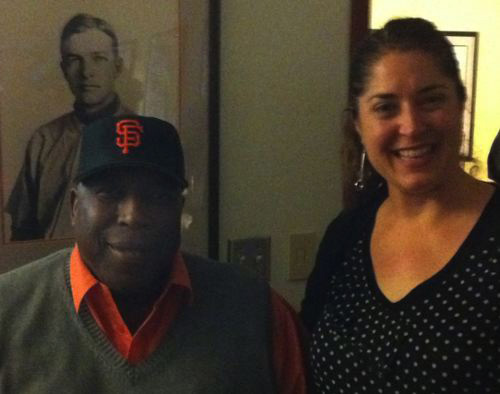
This is a TERRIBLE photograph, but under the auspices of “pictures or it didn’t happen” meme on the internet, I figured I’d own up to it.

Some things to know about this photo:

1) It was taken with a cell phone camera and the photo is fantastically noisy
2) the lighting in the room was TERRIBLE for even the best of cameras
3) It was Friday at the end of a very long week and I was beat down tired
4) I was EXTRAORDINARILY geeked out to be meeting Mr. McCovey

So add all that up and please excuse the terrible photo. Mr. McCovey looks fine. I look like something the cat dragged in.


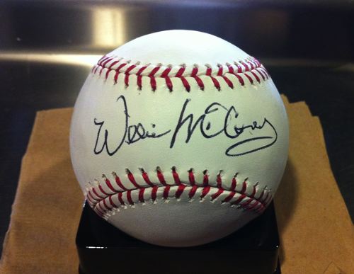
Mr. McCovey signed a baseball for me. Right there. As I watched. He took a baseball, signed it, and handed it. To me.

Oh my dear heavens!

Here, see!!!


I was utterly stunned. Profoundly stunned. Mr. McCovey is a very calm, quiet guy. He speaks with a slight Alabama accent and is quite humble. I thanked him for being with us on that night and he said it was his pleasure.

We had a chance for a quick question and answer session and he was very generous with his time.

During the moments while they were setting up the event for Mr. McCovey to sign baseballs, I said to The Good Man, “Hey, look! That guy over there is wearing a World Series ring! I’m going in to take a closer look.”

The Good Man said, “Well I’m going too!”

So I approached the man and said, “Excuse me, is that a World Series ring?”

He said yes.

I said, “May I see it? I’ve only seen photos.”

The guy said “sure” and then he TOOK THE RING OFF and handed it to me.

I said, “whoa, I didn’t think you’d actually take it off.”

He laughed and said, “well, I don’t think you’re going anywhere.”

So I looked at the ring. It’s really beautiful. Classic diamonds and a deep carved Golden Gate Bridge. So stunning. And to me, so meaningful.

I turned the ring over in my hand and looked at the side. There I saw the name Alioto engraved.

Oh shit. I’d just accosted Giants Vice President Mario Alioto, member of the most powerful family in San Francisco.

Um. Oops. He was quite nice about it, but I quickly handed it back, commenting “it’s really heavy!” and he laughed and joked about it being gaudy (it’s not).

But then the rest of the night I kept saying to The Good Man, “oh god…what was I thinking….oh lord…..what WAS I THINKING?”

I comforted myself by looking at my signed baseball, still so totally in awe.

For goodness sakes, I’d just met Willie McCovey face to face. I spoke to him! I shook his hand!

Gah!!!

Geek out! Double Geek out!!

Needless to say, I had more than a little bit of trouble getting to sleep that night.


Communicatin’

When I read that today’s Theme Thursday is communication, I had to laugh to myself.

See, communication is a great big part of my job. I wear many hats, but day in and day out I’m inundated with communication devices. In fact, stashed in the corner of my office I have a fully loaded box of very old cell phones. Due to a weird contractual issue, I’m not allowed to ditch them to a recycling company. No one wants these damn things (least of all, me) but I have to hang on to them until the contract runs out.

So when I saw today’s theme, I thought “hey, it would be cool to lay all those crappy old flip phones out in a cool design and photograph them.

A short Google search showed me that a man named Rob Pettit already had this idea. And he executed it so much better than I could have.

From Rob’s webpage:

“Rob Pettit, a 2007 graduate of the SMFA, creates cell phone art to high light (sic) the proliferation and waste of cell phones.”

I’ve got a big box of throwaway gear that backs his viewpoint.

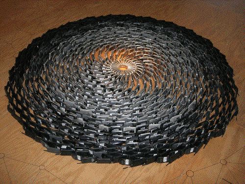
Behold the intricate beauty of Rob’s work (visit his website or click image for full size photo):


These particular devices are what I have a’plenty in my office. Maybe when I’m released from contractual boundaries, I can ship them off to Rob.


Remember StarTac phones? They really work in the outer rings of this piece.


Who would have thought that ugly gray candy bar style phones could be so intriguing? This has an almost industrial, cog in the machinery feel to it.


Am I? Is it? Could It Really Be? Oh. Nope.

As I learn more and more about the art of photography, I’ve become enamored by the retro look photography made popular by the people at Lomography, Hipstamatic and Instagram.

I own several plastic cameras and I actively use the Hipstamatic app on my phone. I’m not as in love with Instagram, but I see a lot of fun photos posted on Flickr and Twitter, so why not?

While perusing the Photojojo online store (I’m a little bitch for Photojojo), I stumbled across the Diana+ lens and adaptor for a DSLR camera.

I was stoked! I don’t own a Diana, though I do own a Holga, and the thought of having the look of a Diana lens on my digital camera made me happy. So I ordered it.

Today I went out in the yard to take the new lens for a spin. I’m not going to lie to you, this is a tough lens to work with. It has zero electronics inside so shooting is all manual. This fact is actually good for me as I need to keep practicing my exposure triangle (ISO, aperture and shutter speed).

When I came inside and took at look at my photos, I felt only sort of “meh” about all of them.

Here’s the best of the lot.


Copyright 2011 by Karen Fayeth

After fiddling with these photos and playing with contrast, I went online to take a look at what others were saying about the lens and maybe pick up a few tricks.

I stumbled across this review from a user named Blunty3000 titled “Stupid Hipster Lens Review – the ‘Dreamy Diana'”.

Blunty’s main gripe seems to be that he had to pay “Sixty sodding dollars” for his lens. From what I can discern, Blunty is from Australia. I only paid thirty sodding US dollars for my kit of lens plus adapter.

Blunty seems to use this product review as a platform to eviscerate hipsters everywhere. Ok, fine. I get that. As for me, I like the retro look photos. I own and enjoy quite a bit of the hipster gear.

But wait. Does that make me a hipster?

Nooo. I mean…I’m over 40. I refuse to wear skinny jeans. I think retro photography is awfully mainstream to be hipster anymore.

Then Blunty makes a point that these hipster photographers are “…pining to feel nostalgia for days they are too young to feel actual nostalgia for…”

Ah. Yes. And there’s the difference. I was actually alive in the 1970’s.

I feel nostalgia for years I actually remember. I’m not a hipster, I’m old.

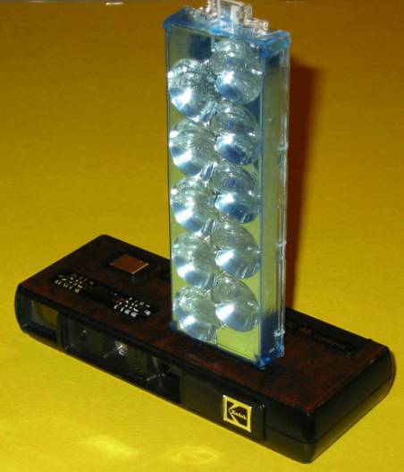
Back then my sister and I shared a suitably uncomplicated (and now very hip) Kodak FlipFlash camera. Ok, it was really hers but when she tired of it, I got it as a hand-me-down.

It looked like this.


Kodak FlipFlash Camera, photo attribution unknown.


Here’s some of the dreamy, out of focus, widely vignetted photos that made me one of the mainstream back then and an almost hipster today.

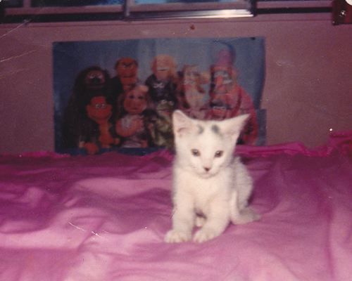
This is our family’s cat as a kitten. And yes, that is a poster of The Muppets in the background. Note the “soft glow” the vignetting, the all around retro feel. This photo is circa 1981. Very hip in 2011.


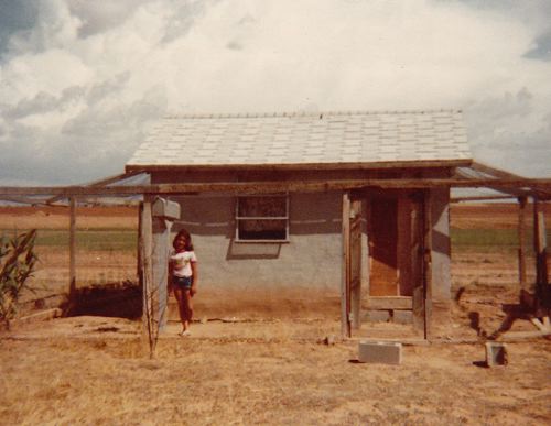
This is me posed at the chicken coop behind our place at Ute Lake. I think my mom took this photo. Maybe my sister. I don’t remember. It has that certain je ne sais quoi with the dry grass, the cloudy sky and the rundown gray stucco chicken coop. How very Grapes of Wrath. I place the year to be around 1977.


So after this dark journey of the soul to determine if I’d become a hipster and should then begin my self-loathing, I’ve come out the other side. I shall go back to shooting my retro cameras with reckless abandon knowing I can make all the old timey photos I want. I lived it baby!


Today when I Googled a photo of an old Kodak FlipFlash camera, I found the *perfect* photo. And where did I find this photo? On my own blog. I’d already posted it a couple years ago. I’m becoming self-referential!


Unless otherwise noted, photos are from my personal family albums and subject to the Creative Commons license found in the far right column of this and every page of this blog.


Common + Camera = Beautiful

Searching for inspiration today, I went to my favorite royalty free photo site and hit the randomizer button until I saw a photo that spoke to me.

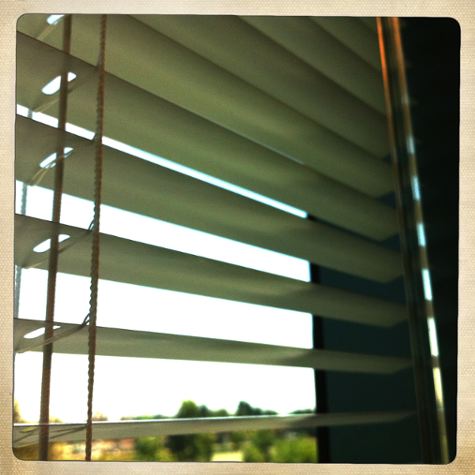
It happened to be a rather well composed photo of window blinds. As I looked at the photo, I began mentally drafting my blog post about how through the eye of the camera and the mind of the photographer, a common item such as plain white venetian blinds can become something beautiful.

I went to download the photo and the photographer’s information for the credit and I was greeted by a form. The photographer wants this form filled out about how, when, where, why you will use her photo. Ok, fair enough.

Then I saw this note at the end of the form, “average response time is 24 days.”

Um. No. I’d like to write this blog post today, please.

So I sat back, grumpy, and tried to think about what else I could write about.

Then I laughed. The answer was so simple. I have off white venetian blinds in my office here at work. I could take my own photo and it would be at least as good as what I saw on that photo sharing site.

A little more work. No extra cost. A lot more fulfilling.

So on my lunch hour I took a hold of my trusty iPhone4 and my favorite Hipstamatic app* and got to work.

As a matter of fact, I did manage to create a photo similar enough to the one I saw with a bit of my own flair. I succeeded at making something common look rather lovely.


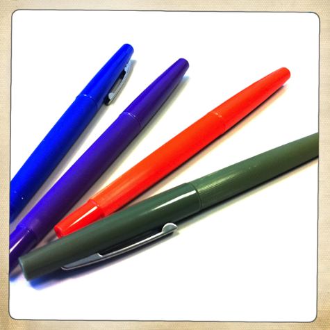
Well I was rather pleased with myself, so pleased that I decided to expand my reach. I challenged myself to create ten photos of regular everyday common objects, and photograph them in a way that makes them look uncommonly interesting.

This was my own personal photo challenge.

New photographers often lament about what to shoot. They know they should shoot more often but take photographs of what? Inspiration is lacking.

I challenge all photographers: Don’t take photos of what everyone looks at and thinks is beautiful. Take photos of what everyone ignores and then make it beautiful.

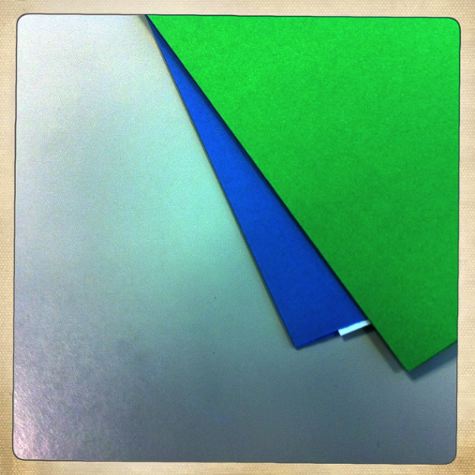
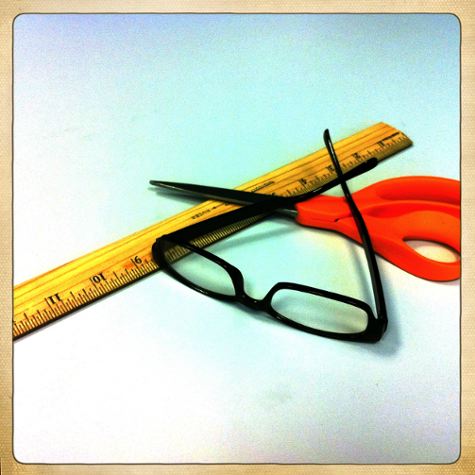
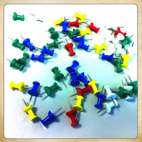
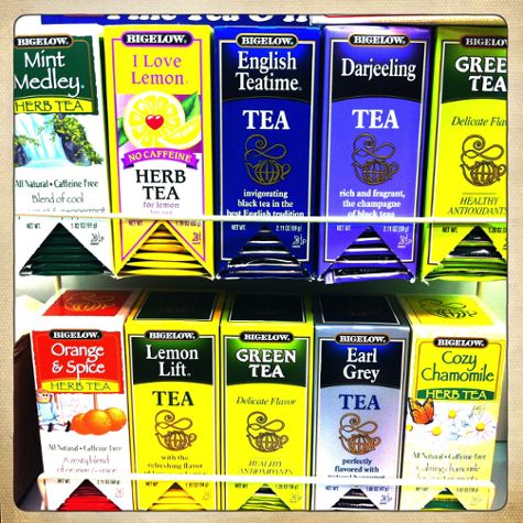
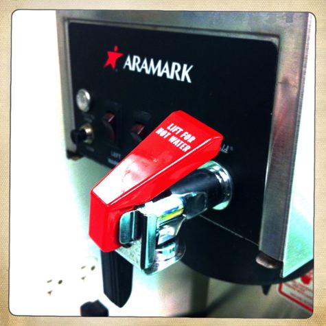
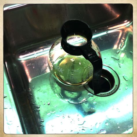
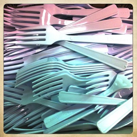
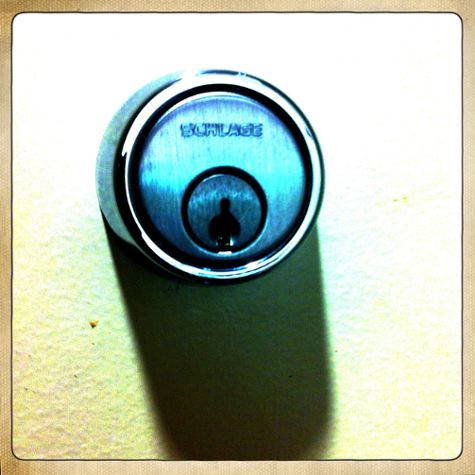
I had to go no farther than my own office and my nearby break room. I’m pretty happy with the results.


(This is my favorite from the day)


All images in this post were taken by Karen Fayeth and subject to the Creative Commons license seen in the far right column on this page.


*For my fellow Hiptamatic geeks, I chose the Hornbecker lens and Ina’s 1969 film. I wanted great color saturation for these photos.