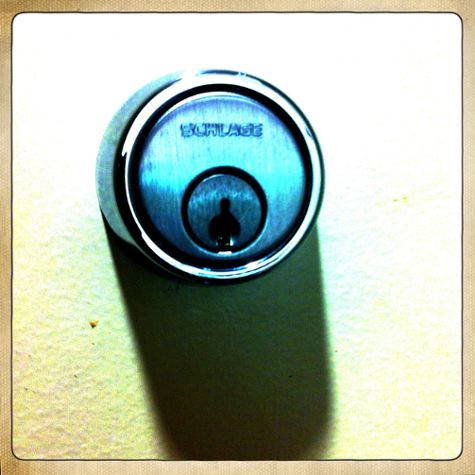
Camera Obscura

According to Wikipedia: “A camera obscura (Latin; “camera” is a “vaulted chamber/room”, “obscura” means “dark”, camera obscura = “darkened chamber/room”) is an optical device that projects an image of its surroundings on a screen. The device consists of a box or room with a hole in one side. Light from an external scene passes through the hole and strikes a surface inside where it is reproduced, upside-down, but with color and perspective preserved.”

According to me, a camera obscura is one of the fun, wacky, quirky things I discovered in my first tentative days living in the Bay Area.

Down at Ocean Beach, over by the Cliff House, there is a really wonderful camera obscura that was installed in 1946.

Just for whimsy, it’s actually shaped like a camera (the camera obscura was a precursor to pinhole cameras and the beginnings of photography).
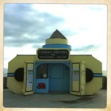


Photo by Karen Fayeth, Copyright 2011

The camera obscura at the Cliff House used to be right next to the Musee Mechanique, a mesmerizing collection of vintage penny arcade games. The Musee Mechanique moved to Fisherman’s Wharf in 2002, but the camera obscura lives on at Ocean Beach.

The little triangle mirror apparatus at the top spins slowly, so you get this really enchanting 360-degree view of the beach, Seal Rocks, and the surroundings. It’s all reflected onto this white dish shaped table in the center of the small, dark room.

Between the camera obscura and the Musee Mechanique, I could get lost for hours. Fresh off the highway from New Mexico, it was some of the coolest stuff I’d ever seen in my life.

When The Good Man and I paid a visit to the Cliff House this weekend, I was so excited to see the camera obscura is still there. It wasn’t open that day, but it’s there. And that makes me happy.

It was added to the National Register of Historic places in 2001, and is now under the conservancy of the National Park Service, so hopefully it will project on for many years.

The camera obscura makes me so nostalgic. I adore it!

That’s me. My purse was under my jacket, so that’s why my jacket tails are sticking out at such an angle. That and the fact that I’m simply a dork of epic proportions.
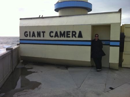


Photo taken by The Good Man, Copyright Karen Fayeth 2011


Photos Copyright Karen Fayeth 2011, and taken with an iPhone4 using the Hipstamatic and the Camera+ apps.
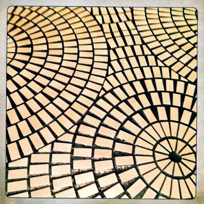
Obessed by Floors

There’s this hotel in San Francisco that’s technically in the Financial district but really is so close to the Embarcadero you can taste it (not that you’d actually want to taste the Embarcadero. That’s just ew.).

The hotel is the Hyatt Recency and it’s not only a hotel, it’s also a movie star. The Hyatt featured prominently in the Mel Brooks movie High Anxiety and also served as the lobby for the The Towering Inferno.

I am utterly fascinated by this hotel. It’s a quirky place and definitely has this 1970’s vibe. It was opened in 1973 and I’m guessing it was pretty cha-cha for the time.

It’s odd shaped. The huge atrium is profound. The open hallways looking into the atrium do give a bit of vertigo.

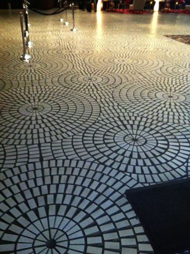
But while that’s all fascinating…it’s the floors that get me. I’m literally obsessed with these floors.

Here’s a couple photos. The patterns just kill me! (in a good way)


Photograph by Karen Fayeth, Copyright 2011


Photograph by Karen Fayeth, Copyright 2011


I can’t even begin to imagine how long it took to lay all of those tiles in patterns across not only the huge hotel atrium but also on all four buildings of the shopping center next door.

The floors have a seventies vibe, to be sure, but there is something engaging about them too.

I can catch a glimpse of these floors in a movie or old photo and I know exactly where they are.

It’s just another one of those oh-so-uniquely San Francisco things.


Yes, I wrote a whole blog post about floors.


Photographs by Karen Fayeth, Copyright 2011, and subject to the Creative Commons license in the far right corner of this blog. Photos takes with an iPhone4 (I haven’t set up the new phone yet) and using the Camera+ and Hipstamatic apps.


Quality Control

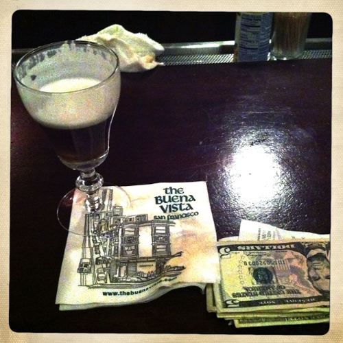
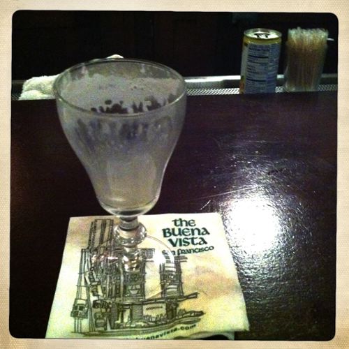
You might recall a few months back (July, actually) I posted a story about San Francisco’s celebration for a glass.

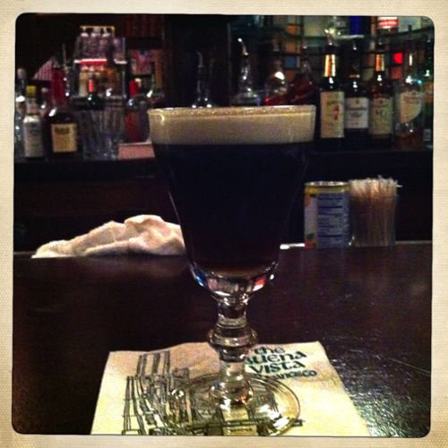
A perfect, petite glass, just ripe to be filled to the rim with Irish coffee.

This past weekend, The Good Man and I had much to celebrate, so we spent the weekend rabble rousing from one end of the beautiful City of San Francisco to the other.

It was a magical weekend.

After consuming an insane amount of food at Tadich Grill, a venerable old place dating back to 1849, we set out on the quite stormy Saturday night and ultimately found ourselves at the Buena Vista down on the Wharf.

The Buena Vista is one of my most favorite places in the City. Especially on a cold, rainy night.

I was there in an official capacity, of course. It was necessary to investigate this whole glass issue for myself.

You know, in the interest of quality control and all that.


After the first Irish Coffee, I was intrigued.


After the second Irish Coffee, I was quite contemplative.


After the third Irish Coffee, I was…wait…what were we talking about…..?


*hic* Yes, I found the glasses at the BV to be of fine quality and most upstanding in their capacity to serve a nice warm beverage.

Or something.

I slept rather well that night, too……


All photographs Copyright Karen Fayeth, 2011, and subject to the Creative Commons license found in the right column of this page.

Photos taken with my iPhone4 and the Hipstamatic app.


Am I? Is it? Could It Really Be? Oh. Nope.

As I learn more and more about the art of photography, I’ve become enamored by the retro look photography made popular by the people at Lomography, Hipstamatic and Instagram.

I own several plastic cameras and I actively use the Hipstamatic app on my phone. I’m not as in love with Instagram, but I see a lot of fun photos posted on Flickr and Twitter, so why not?

While perusing the Photojojo online store (I’m a little bitch for Photojojo), I stumbled across the Diana+ lens and adaptor for a DSLR camera.

I was stoked! I don’t own a Diana, though I do own a Holga, and the thought of having the look of a Diana lens on my digital camera made me happy. So I ordered it.

Today I went out in the yard to take the new lens for a spin. I’m not going to lie to you, this is a tough lens to work with. It has zero electronics inside so shooting is all manual. This fact is actually good for me as I need to keep practicing my exposure triangle (ISO, aperture and shutter speed).

When I came inside and took at look at my photos, I felt only sort of “meh” about all of them.

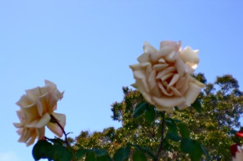
Here’s the best of the lot.


Copyright 2011 by Karen Fayeth

After fiddling with these photos and playing with contrast, I went online to take a look at what others were saying about the lens and maybe pick up a few tricks.

I stumbled across this review from a user named Blunty3000 titled “Stupid Hipster Lens Review – the ‘Dreamy Diana'”.

Blunty’s main gripe seems to be that he had to pay “Sixty sodding dollars” for his lens. From what I can discern, Blunty is from Australia. I only paid thirty sodding US dollars for my kit of lens plus adapter.

Blunty seems to use this product review as a platform to eviscerate hipsters everywhere. Ok, fine. I get that. As for me, I like the retro look photos. I own and enjoy quite a bit of the hipster gear.

But wait. Does that make me a hipster?

Nooo. I mean…I’m over 40. I refuse to wear skinny jeans. I think retro photography is awfully mainstream to be hipster anymore.

Then Blunty makes a point that these hipster photographers are “…pining to feel nostalgia for days they are too young to feel actual nostalgia for…”

Ah. Yes. And there’s the difference. I was actually alive in the 1970’s.

I feel nostalgia for years I actually remember. I’m not a hipster, I’m old.

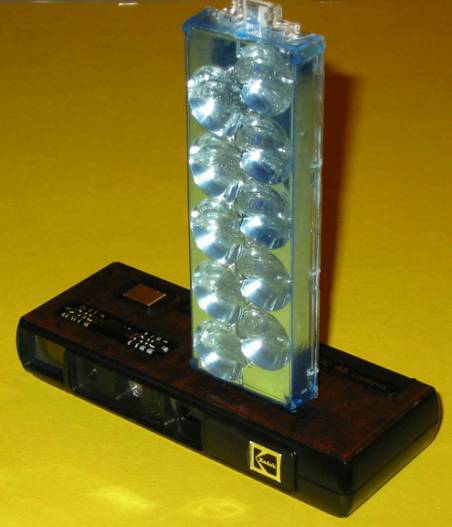
Back then my sister and I shared a suitably uncomplicated (and now very hip) Kodak FlipFlash camera. Ok, it was really hers but when she tired of it, I got it as a hand-me-down.

It looked like this.


Kodak FlipFlash Camera, photo attribution unknown.


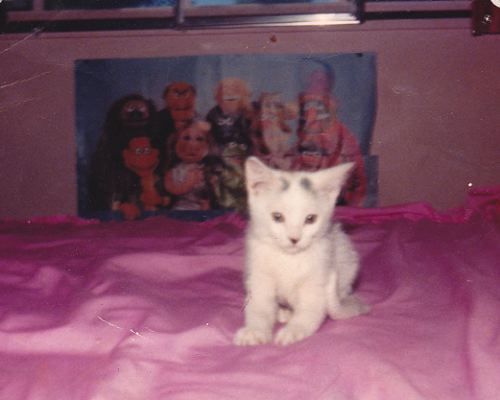
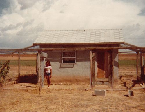
Here’s some of the dreamy, out of focus, widely vignetted photos that made me one of the mainstream back then and an almost hipster today.

This is our family’s cat as a kitten. And yes, that is a poster of The Muppets in the background. Note the “soft glow” the vignetting, the all around retro feel. This photo is circa 1981. Very hip in 2011.


This is me posed at the chicken coop behind our place at Ute Lake. I think my mom took this photo. Maybe my sister. I don’t remember. It has that certain je ne sais quoi with the dry grass, the cloudy sky and the rundown gray stucco chicken coop. How very Grapes of Wrath. I place the year to be around 1977.


So after this dark journey of the soul to determine if I’d become a hipster and should then begin my self-loathing, I’ve come out the other side. I shall go back to shooting my retro cameras with reckless abandon knowing I can make all the old timey photos I want. I lived it baby!


Today when I Googled a photo of an old Kodak FlipFlash camera, I found the *perfect* photo. And where did I find this photo? On my own blog. I’d already posted it a couple years ago. I’m becoming self-referential!


Unless otherwise noted, photos are from my personal family albums and subject to the Creative Commons license found in the far right column of this and every page of this blog.


Common + Camera = Beautiful

Searching for inspiration today, I went to my favorite royalty free photo site and hit the randomizer button until I saw a photo that spoke to me.

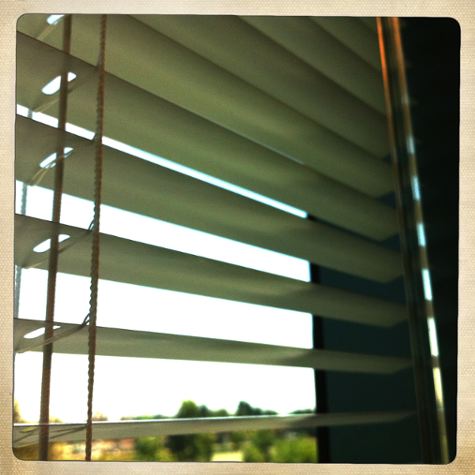
It happened to be a rather well composed photo of window blinds. As I looked at the photo, I began mentally drafting my blog post about how through the eye of the camera and the mind of the photographer, a common item such as plain white venetian blinds can become something beautiful.

I went to download the photo and the photographer’s information for the credit and I was greeted by a form. The photographer wants this form filled out about how, when, where, why you will use her photo. Ok, fair enough.

Then I saw this note at the end of the form, “average response time is 24 days.”

Um. No. I’d like to write this blog post today, please.

So I sat back, grumpy, and tried to think about what else I could write about.

Then I laughed. The answer was so simple. I have off white venetian blinds in my office here at work. I could take my own photo and it would be at least as good as what I saw on that photo sharing site.

A little more work. No extra cost. A lot more fulfilling.

So on my lunch hour I took a hold of my trusty iPhone4 and my favorite Hipstamatic app* and got to work.

As a matter of fact, I did manage to create a photo similar enough to the one I saw with a bit of my own flair. I succeeded at making something common look rather lovely.


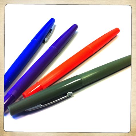
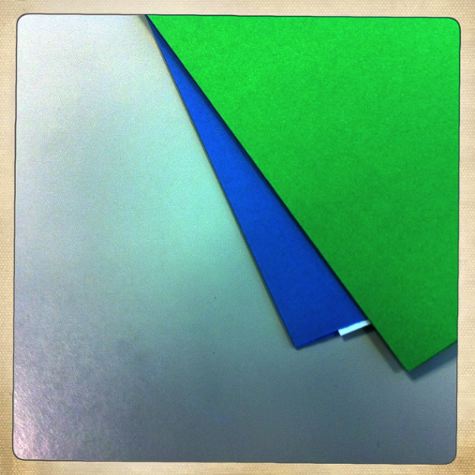
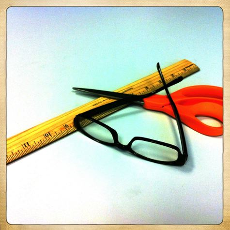
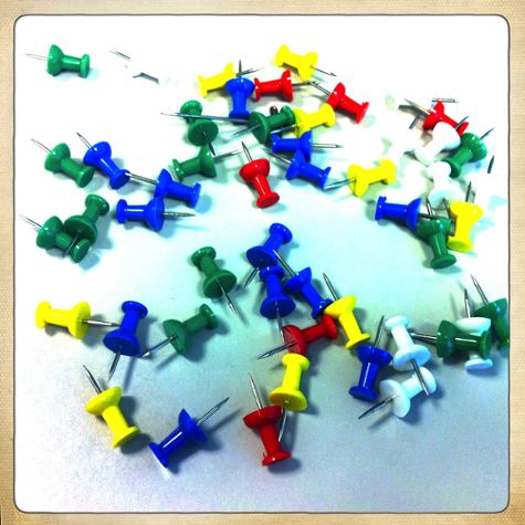
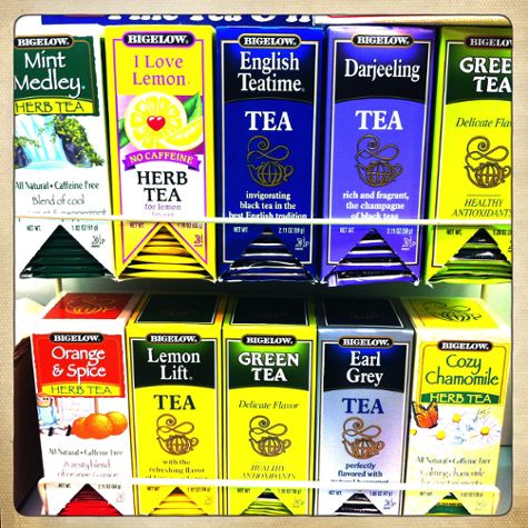
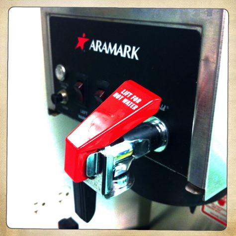
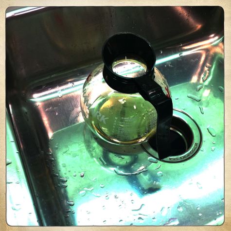
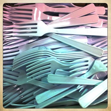
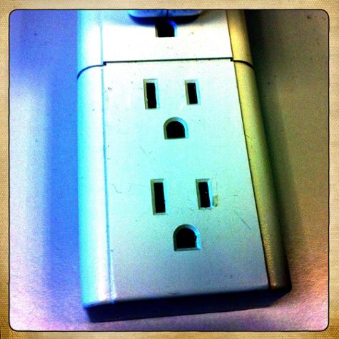
Well I was rather pleased with myself, so pleased that I decided to expand my reach. I challenged myself to create ten photos of regular everyday common objects, and photograph them in a way that makes them look uncommonly interesting.

This was my own personal photo challenge.

New photographers often lament about what to shoot. They know they should shoot more often but take photographs of what? Inspiration is lacking.

I challenge all photographers: Don’t take photos of what everyone looks at and thinks is beautiful. Take photos of what everyone ignores and then make it beautiful.

I had to go no farther than my own office and my nearby break room. I’m pretty happy with the results.


(This is my favorite from the day)


All images in this post were taken by Karen Fayeth and subject to the Creative Commons license seen in the far right column on this page.


*For my fellow Hiptamatic geeks, I chose the Hornbecker lens and Ina’s 1969 film. I wanted great color saturation for these photos.