Winning Is Like…Better Than Losing
Now that I have been a member of the photography club at my place of employment for just over a year, and have been attending meetings and listening hard, I think I maybe kind of sort of have earned a teeny tiny bit of respect.
Because this month, both of my submissions for the monthly photo contest made the cut. BOTH!
The rules each month are that you get to submit two photos. We review and critique all the photos in our monthly meetings and then there is an anonymous voting app we use. When votes are tallied, the top four vote getters are published internally at the company.
So yeah baby! I have had one of my photos make the cut before, but never both. It is a little unprecedented. Woo hoo!
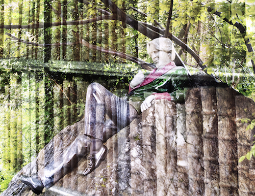
The theme this month was double exposure and my two prize winning photos are below for your perusal.
The first one feels really special to me. I took both of the photos in the image while I was in Dublin. It was at the end of my one lone day of tourist time after an intense week of work, and I had walked for miles. I was exhausted and it was raining like it only can in Ireland.
Tired and soaked to the bone, I was bound and determined to find this sculpture of Oscar Wilde. This was after I had stood in a very long line (in the pouring rain, a nice lady shared her umbrella) at Trinity College to see the Book of Kells. That exhibit was exhausting in itself. Way too many people jostling around.
The park where Oscar resides is about half a mile from Trinity college and I wasn’t sure I was going to make it. It was driving rain and windy and I was so tired that a nice warm cab looked like a good idea. I stopped to rest twice on the short journey, but forced myself to keep going and once I arrived at the park I was glad I did.
The small, lush, green Merrion Square park was silent as I stood there getting drenched looking at this remarkable statue of Oscar Wilde. A small tour group came by and the tour guide said the artist sourced these incredible and colorful stones from all around the world. It is a beautiful statue and so unique as it reclines on a rock.
When it came time to figure out something to use for double exposure, I thought of this statue and of the very old books I had seen at the Trinity College library (I had watched a video about the method used to bound the tomes and was endlessly fascinated).
Using some tools I had learned in a recent photography class about overlay for textures, I fiddled around in Photoshop and came up with this:
Title: Author

Photograph Copyright © 2014, Karen Fayeth
I was unsure if the photographers in the club would find the image too discordant. It’s almost jarring, but I love it. It’s hard to photograph a statue and have it be anything more interesting than a photograph of a statue. This to me brings depth and texture to the photo and I am so happy with the results.
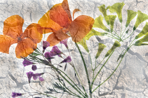
The other photo I submitted was something I had been visualizing for quite some time.
As I continue to hear all of the news reports about the drought here in California, I was pleasantly surprised that the lack of rain didn’t halt the springtime explosion of California wildflowers. I am mildly obsessed with California Poppies (the state flower) and I love the yellows, reds and purples of other flowers growing in medians, between sidewalk cracks and at the edges of yards.
I picked several of the flowers and shot them using a technique I learned from photography master Harold Davis. Then I took a free stock image of textural dry and cracked ground and combined it with my flower photo. When I look at it, I think of many things I could (and should) go back and tweak, but so far this photo is garnering nice attention.
Title: Drought

Photograph Copyright © 2014, Karen Fayeth
When submitting both of these photos, I wasn’t sure how my surly team of scientists would respond. Both of these photos are kind of arty, but they also show I have some Photoshop chops, and I think they liked that. They had a lot of questions for me on technique since I used a different approach for each photo.
Also, I think the club as a whole struggled with the idea of double exposure. It’s too messy for their orderly minds. I had a film camera in high school that I liked for making double exposures. It can either look weird or really cool. Doing a double exposure in Photoshop gives me more control over how the two photos overlap and how the double exposure looks, and I like it.
Anyhow, thought I’d share my winning photos with you.
Next up, travel to Amsterdam. Wonder what treasures I can find to photograph there?
Both images, Copyright © 2014, Karen Fayeth. Shot with a Canon G10 and combined in Photoshop. Stock image of dry ground from Free Stock Textures.